
This project has been initiated and is funded primarily by the Goethe-Institute; Curatorial Director: Barbara Steiner.
It is an art project that looks into the possibilities and impossibilities describe, propose and reflect on the idea of Europe and its multitute of versions and personas through artistic practice.
Curators from 9 European cities that represent key characteristics and ambivalences of Europe have been invited to test / exhibit artistic work in three consecutive shows, Scenario 1, Scenario 2, and Scenario 3.
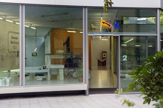
Here some more detailed information about the Graphic Scenario that dominates the entrance area:
Often enough it is visual, graphic languages, that - besides abstract concepts - transport locally conceived ideas into other countries and contexts, and are by themselves articulating values and might even form a
movement in its own right.
For the first graphic scenario in the entrance area one of these
graphic means of expression is once again tested: the forms of Jugendstil.
An intrinsically European movement of the end 19th / begin 20th
century, that expressed itself in a variety of regional and national variations: in the work of the Viennese Werkst?tte, Art Nouveau, Art Liberty
and other manifestations of the coincidence of reform and aesthetic
reduction. Not least because of the unbroken power of its style and idiosyncrasies, today this language seems locked in art history or confined
to the banal and camp ornamentations of restaurants and
souvenir-shops.
A fake marble decor using traditional techniques has been painted
on the 12m long wall in the entrance area; black industry-standard vinyl
was applied afterwards. The typography is referencing the groundbreaking
type-design by Otto Eckmann (1865-1902), who had created
this hybrid between a broken script and serif typeface in 1900. For this
scenario display Eckmann's design has been extended through a bespoke,
lighter version for the wall texts. It is accompanied by a Post-War
Modernist typeface, Haas Unica (1980), by Andr? G?rtler.
This space is addressing the role of design as a discipline, especially
with reference to a key-situation in history where there had been
significant overlaps of fine art, design and craft - designing and 'decoration'
with consciously orchestrated surfaces and possibilities. In applications,
like the T-Shirt design, complex graphic codes and the attempts to
assign signs and symbols to political or musical movements, or corporate
cultures, is reflected. Furthermore, as part of the overarching exhibition-
design, ambiguities in the representation of political insignia, logos
of funding bodies and fictional symbols are, on the yellow side-wall, both
generated and revealed.
