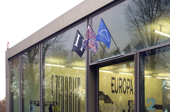

2nd in series of art exhibitions initiated by Goethe-Institut, hosted by GfZK Leipzig. Curatorial direction: Barbara Steiner?
Making You Dance
This Graphic Scenario is a reflection upon an episode of historical, graphic agitation of popular culture. It is theatrical in two ways: initially for being rampant and raw - and secondly in its omnipresent commercial opportunism. It deals with transformations of codes and identities of cultural minorities into material that the graphic design Avant-Garde considers now "toxic". ?
About 740 million people live on the European continent. Events that give a sense of togetherness are sparse. Nevertheless, "a formula for ways of making you dance", as the author Peter York has called it, is perhaps one.
Since the mid 80s various graphic forms have been developed in English subculture and diverse Post-Punk music scenes, which were inspired, amongst others, by Pre-War-Modernist Russian Constructivist graphics. Subsequently, in variations and derivates they become, via Raves of electronic dance music as impulses, a Pan-European currency for professional clubbing and the distribution of mass-entertainment, consumption - and a party-culture that ignores national boundaries. After the fall of the iron curtain in 1989 and the resulting new currents of consumers and work forces, the powers inherent in these graphic surfaces get a second life, as they become a generic language with Go-West undertones.
The hand-lettered typefaces and layouts that the English graphic designer Neville Brody produced for fanzines and later magazines, like the THE FACE, are a central point of reference to the display. They embody the potency and corruption of an era of "flash and trash". Almost simultaneously to the dramatic changes in Europe after the collapse of Communism, the so-called digital revolution allows for the unhindered transfer of graphic styles via digital fonts beyond national boundaries. The design of the graphic display in the entrance area is making use of typical means of production of the period. Blown-up pictures and type are applied to the wall using traditional poster paste. All the information about the exhibition are integrated in the surfaces of a table and a vitrine in the shape of a cut'n'paste layout, like spreads in an editorial mock-up.
Instead of uniformity the concept for the captions for the various exhibition zones is opting for heterogeneity: the curators or artists were invited to design the captions themselves, or work with a designer. Hence, the solutions vary and emphasize the diverse backgrounds of the participants.
